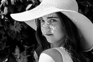
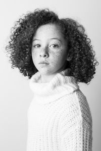
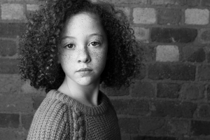
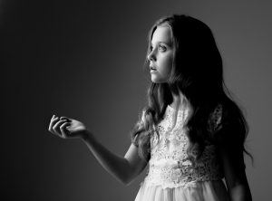
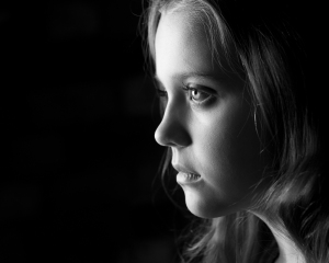
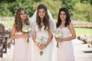
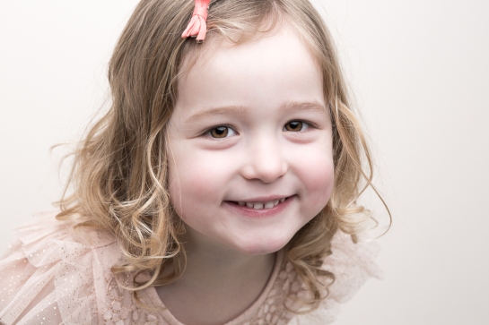
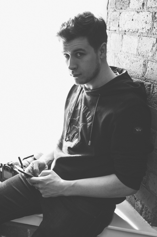
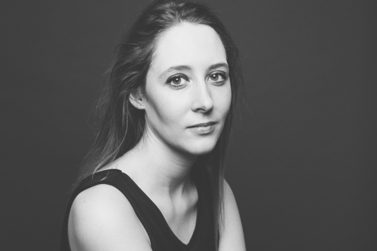
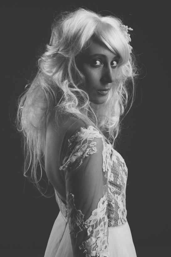
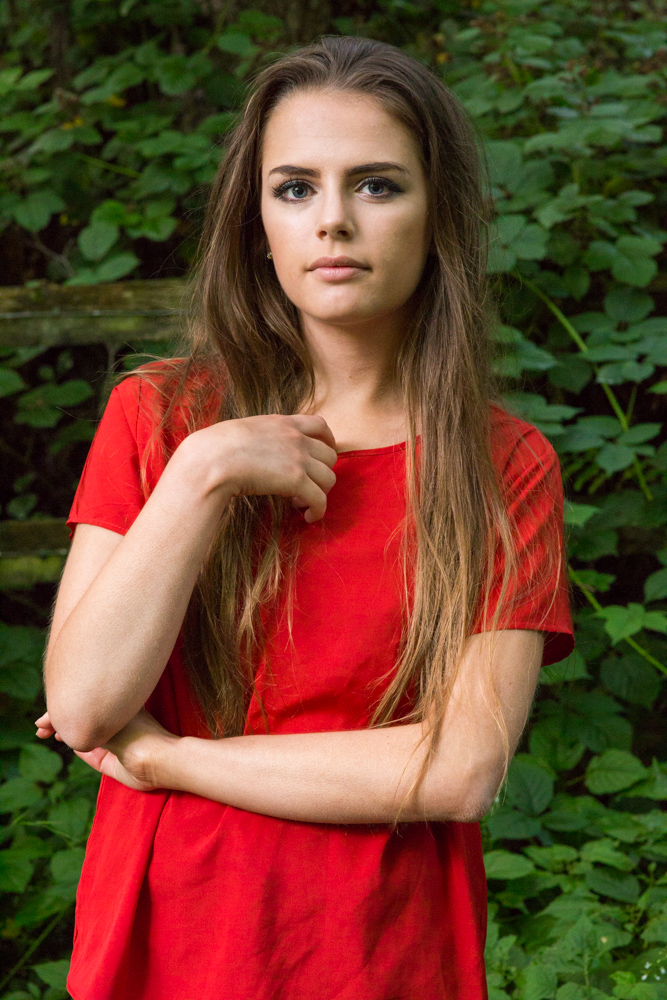
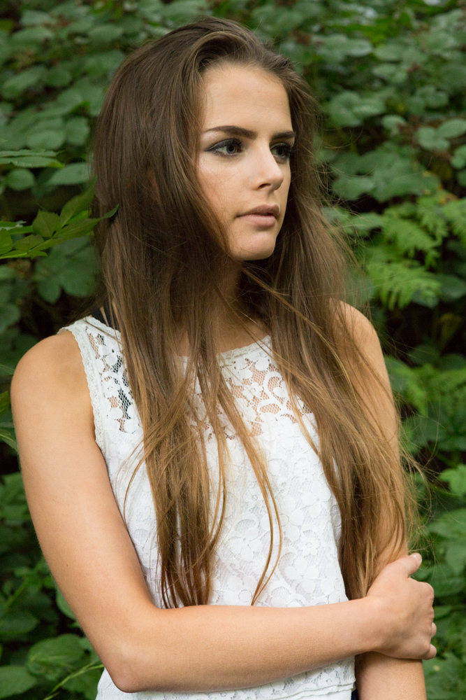
I was thinking for a long time how to approach this last assignment, what I always wanted is to have my own distinctive style which instantly separates me from other photographers, but I felt I was never really consciously working towards it. So my personal project became to find how I want to feel when I look at my images, how the images make me feel. Of course it always will be a work in progress, I do like this set of images because of the harmony of the colours, I like natural and warm tones when almost everything matches with the skin, I cannot tell exactly my feelings just yet but these images made the selection for the same reason: soft, fine art facial expressions.
Final Images


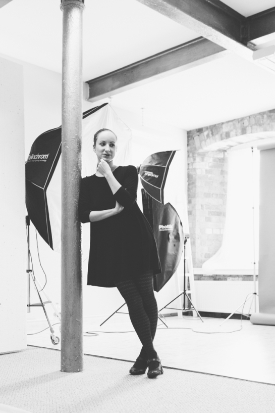
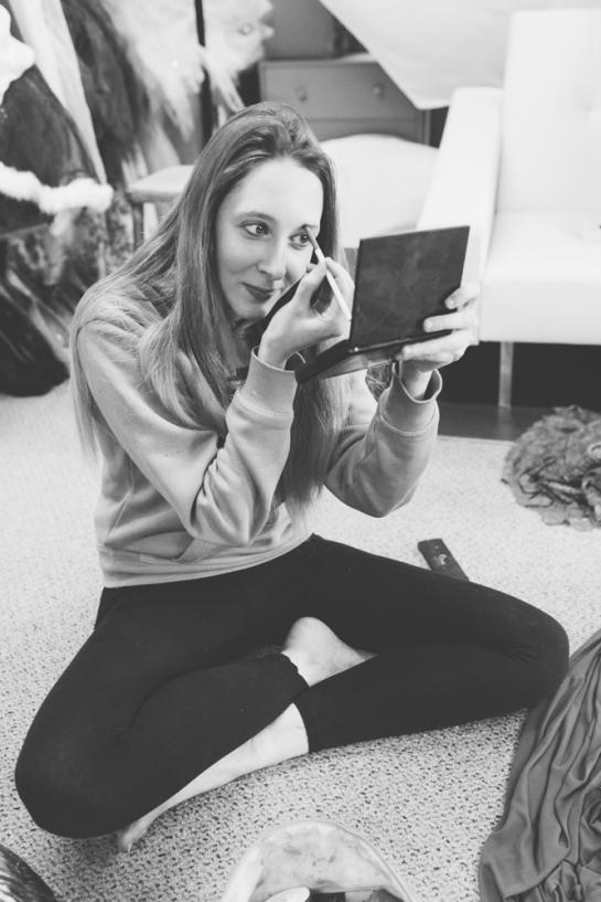
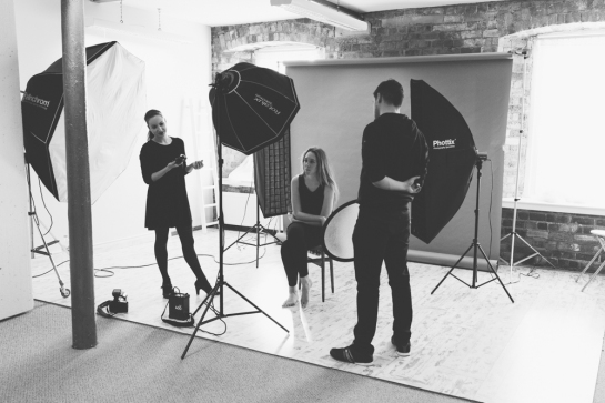
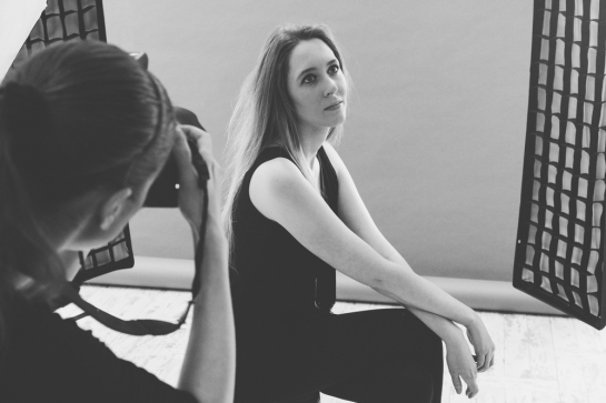
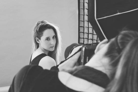
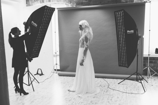
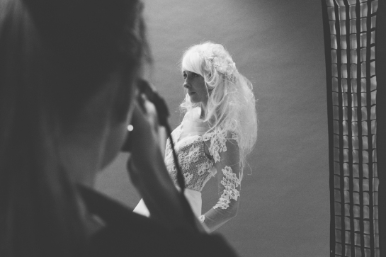
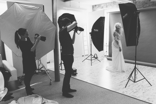
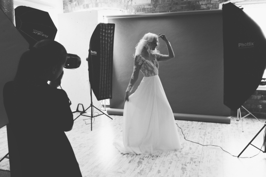
The preparation
Initially I was only looking for matching coloured images, but I began to refine my selection when it came to expressions and how the images made me feel, also changed my philosophy on matching crops to different ones, because I was just bored seeing the same headshots over and over again. I wanted a wider selection of portraits, not just close ups, but including props and demonstrating different angles and different lighting patterns.
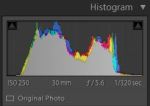
These images were shot on different backdrops with different lighting but I applied similar settings in the post production process with Adobe Photoshop:
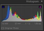
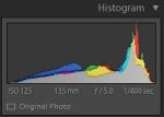
- First, I applied custom white balance to suit each image because no skin tone the same, I pushed the temperature slider to the right to warm up and added little tint again by pushing to the right
- Softened bags under the eyes as well as skin blemishes, very subtly
- Gentle “dodging” on the forehead, top of the nose, under the eyes, middle of the bottom lip and top of the chin, where the light is naturally hitting the face, I just highlighted a little bit more, subtle “burning” around the cheekbones, corners of the forehead where are shadows appear naturally.
- I did little sharpening on the eyes with “High Pass” filter, also brightened them up a little bit using “Curves”
- Finally warm tone colour grading using “Gradient Map”, opacity around 50%.
Feedback and reflection
Overall I am pleased with the selection, but in the future I would like to shoot more working on my “style” consciously, creating sets with interesting details, props, playing with poses and expressions more to create soft and feminine but interesting and edgy compositions, in studio and on location as well. I haven’t been able to spend much time with my studies unfortunately, I have been working every single day for over two years now which led to problems with my health, I have a plan to get out of this situation but it won’t happen overnight, hopefully will be able to spend the right amount of time on my studies and complete the course on time.
As my tutor suggested, I looked into Angelica Dass’s work, which I found incredible, I had similar thoughts how would it look if I would change the background colour of each photograph for the subject’s skin colour, but the key again is consistency, her subjects are in the same position, crop is the same with each image, so even it is a simple concept, it is very powerful because of the message it coveys, also the power of simple headshot, only the skin shows, there are no distracting elements like clothing.
I will experiment with this type of colour matching in the future but will try and come up with something unique in the same time, maybe even beauty photography, perhaps my subjects have something common painted on their face? Or maybe the same makeup but different ladies as subject? This beautiful series of images got me thinking.